


GrayGrids Team
in Resource
Updated on: 2/10/2026
30+ Best CSS Frameworks to Use in 2026
CSS stands for Cascading Style Sheets. If HTML is for the structure, CSS specifies the document’s style—page layouts, colors, fonts, etc. If HTML is the foundation, CSS is the aesthetic choice. CSS defines styles for your web pages. They include the design, layout, and display variations for different devices and screen sizes. For web developers or designers, CSS is like a blessing by the World Wide Web Consortium (W3C). To make the journey smoother, we’ve gathered the best CSS frameworks to simplify your web development experience.
This style sheet language simplifies the process of making web pages. It’s easy to learn and understand. The best CSS framework, a curated collection of prepped and ready-to-use CSS stylesheets, further simplifies this process. This framework saves time by enabling a smoother development cycle and fewer bugs. Teams with multiple developers, especially larger ones, can appreciate the standards that frameworks bring to the table.
Best CSS Framework for 2026
Presenting the Best, Trendy, and Popular CSS Frontend Frameworks for 2026, check this out and meet the better framework you’ve met earlier.
Bootstrap

Bootstrap stands as the world’s most popular frontend framework, renowned for its powerful features and user-friendly interface. It is an ideal choice for web designers and developers, enabling rapid prototyping of websites and the creation of beautiful, Bootstrap-based mobile apps.
In line with modern design standards and a wide range of possibilities, Bootstrap 5 puts CSS3 at the forefront of the framework. This version unleashes the immense capabilities of CSS to build grid systems, create buttons, implement responsive design, and much more. Whether you’re gearing up for the new features or sticking with the previous version, your choice depends on which best serves your needs.
Tailwind CSS

Tailwind CSS stands out as the best CSS framework for building faster custom designs. It provides a low-level CSS framework for custom designs without ever leaving the HTML. Also, we have a penalty for free Tailwind CSS Components. Additionally, with responsive variants, it effortlessly constructs responsive interfaces without suspending the custom CSS. Moreover, it comes equipped with component-friendly tools. Notably, the framework is composed in PostCSS and configured in JavaScript. This configuration provides you with the power of a real programming language.
Ant Design

Ant Design system is for enterprise-level products. It creates a skillful and pleasant work experience. This system is based on four design values: Natural, Reliable, Significant, and Growing. The goal is to standardize the user interface specs and slow down excesses and unnecessary production costs. This will help product designers concentrate on a safer user experience. For designing web applications, the system has an Enterprise-class UI.
Bulma

Bulma is a free, open-source CSS framework based on Flexbox. It’s manageable to acquire and apply. The package includes rich UI components with ample bars, tabs, panels, boxes, media objects, and more. Because this framework is built with built, it is very modular. It has brilliant class names. The modifiers are convenient too. 100% responsive framework.
UIkit

UIkit is a lightweight and modular front-end framework for expanding quick and great web interfaces. The Zip file holds the assembled CSS and JavaScript files, which is everything you need to get started. Using UIkit works best. we suggest that you install one of the autocomplete plugins for your preferred IDE or code editor. That avoids wasting time, as you won’t have to look up and type all UIkit classes and markup.
Foundation

Right now, Foundation stands out as the most valuable frontend framework, capturing the attention of all developers’ minds— and rightfully so. The responsiveness of this framework provides a rapid solution to your design needs within no time. With Foundation, you’ll be able to effortlessly build any kind of web or mobile applications and create websites and email templates without the need to hire any professionals.
Furthermore, keeping up with the documentation is key. This will help you delve deeper into the style section of the framework, where you’ll discover a plethora of components including navigation, layouts, typography, media, controls, containers, libraries, plugins, and SASS. Out there are a ton of video tutorials on this framework and of course, it’s easy to learn is waiting for you.
Pure

It is a set of inadequate, responsive CSS modules. That can be used in every web project. Considering mobile devices we keep our file sizes small. It’s fully responsive to any device. By using Grid, Menu, and many more, they make it easy to create stunning layouts. The design is unopinionated, minimal, and smooth. We believe that it’ll be much easier for you to customize your web project.
Basscss

Basscss is a low-level CSS toolkit. Having clear, refined naming codes Basscss is fast to internalize. This toolkit speeds up the development time with more scalable, more readable code. Reusable, interoperable styles work like building blocks to lay the foundation for any stylesheet and can be mixed and matched in any number of combinations. Basscss strikes a balance between consistency and flexibility for clear, refined naming codes.
Semantic UI
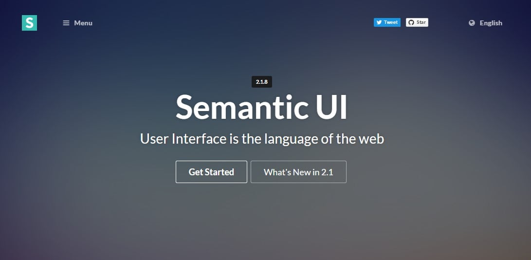
In the last few years, Semantic has grown in enormous esteem between front-end developers and designers. You must know it’s currently, as usual, to see Semantic design methodology being joined in different systems and devices that permit the usage of third-party style guides.
The biggest attraction of Semantic UI seems to be its range of elements that can be built using Semantic elements. So there are common elements such as buttons, dividers, and loaders. It’s an easy task to get acquainted with the rich collection of form and breadcrumbs. A simple and sophisticated view that is full of the latest modules like popups, dropdowns, sticky boxes, and much more.
If you’re a beginner or mid or advanced-level web front-end designer or developer, don’t worry it’s too easy to use and of course, it will surpass your previous workflow.
Materialize
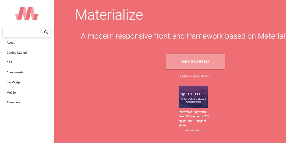
In terms of increasing popularity, we already know that the material design CSS framework surpassed everything else by appreciation, competition, and wide-ranging functionality. Materialize framework is the coolest CSS-based material design framework with 15000 stars on GitHub.
Along with the CSS components Materialize aims to provide a different planned category with JavaScript, Mobile, and other Components. On the other hand, you can follow the other designs from the showcase option on this Materialize website.
Material Framework
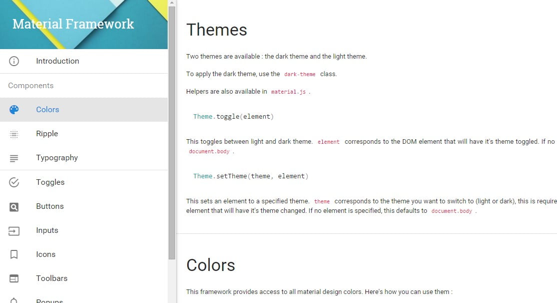
Google’s materials design changes the way of thinking and planning by the technically proven concept of building a beautiful website. It helps to change your web design concept in a simple and precise way. The Material design of Google has gotten bigger the past ever since Google made the requirement available, and while it is based on several CSS frameworks we have seen already as well as all kinds of tutorials developed from the position to help designers or developers fit in the full perspective of material design in their projects such as websites, platforms, apps and different kinds of software.
CLANK
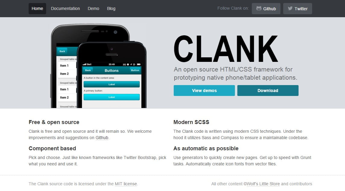
Clank is an open-source framework that uses modern CSS techniques. Comes with a very good collection of HTML as well as CSS components, along with its own SCSS file. It applies an easy variable to modify the complete look of the website, like changing every component color within the blink of an eye.
It also has several devices to complete every action and wrap items, which is like a trial screen of devices to give you the complete feeling of the website after design.
Baseguide
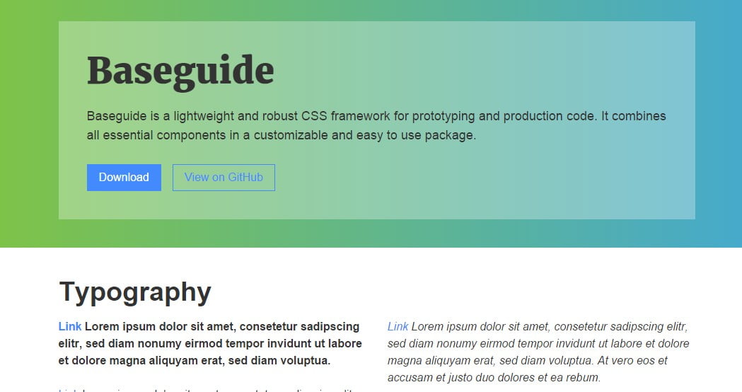
Baseguide is a lightweight CSS3 framework that puts together the fundamental components of a web design into a petite and solid library. All kinds of framework components are fully responsive and can be balanced to your project requirements. In this minimalistic CSS framework, you can manage your forms simply with native CSS.
Modest Grid

In every developer’s eye, everyone just hangs after the reliable things. And Modest Grid also comes with the same reliable components to fit in every developer’s pocket. Modest Grid offers a huge base to begin plugging away all kinds of elements as well as components from other front-end frameworks. Although this framework is under development for giving a new amusement in frontend development, stay tuned with Modest Grid.
Turret
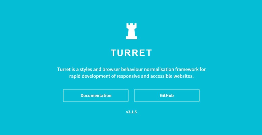
Turret is a quick framework for website development focusing on responsive web design to ensure higher quality. Along with the modern CSS3 Turret uses LESS for processing functions and HTML5 semantic style to focus on simplicity. The framework also work with normalizes which develop HTML file entirely and handy.
Schema
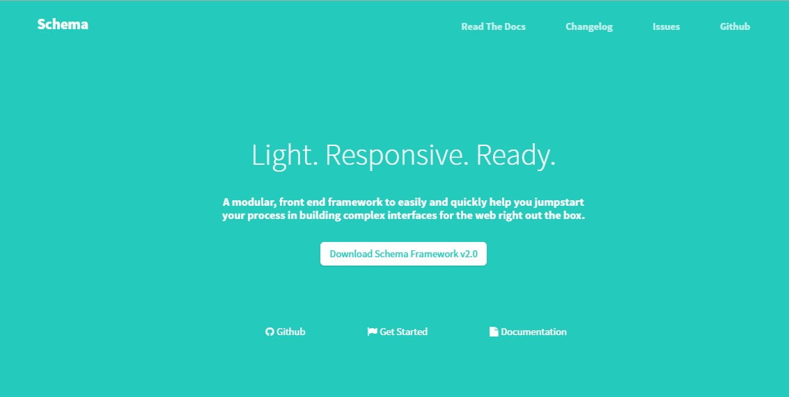
Schema is offering you a flexible yet powerful front-end experience that will help the designers and developers build a well-furnished website. This minimalistic framework will suit all kinds of requirements along with its latest CSS3 features. If you want to find yourself handy with it, you must read the documentation section and make yourself useful with it.
Metro UI
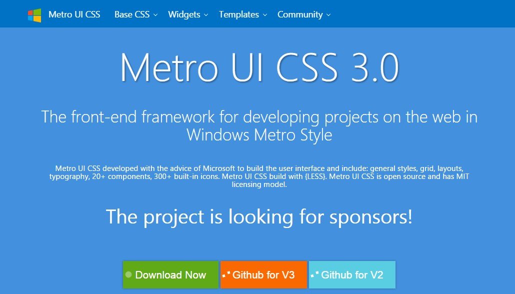
Metro Style is already making waves in the web frontend industry. It’s a frontend framework module that seamlessly brings the essence of Windows to your web page. The excellent configuration of Metro UI empowers you to embark on any kind of front-end project. Moreover, Metro UI facilitates website construction with its three hundred-plus icons, layouts, grids, styles, and many more components.
Responsive Grid System
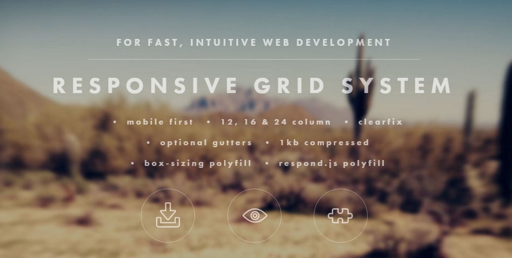
Responsive Grid System is a full-fledged web engine to develop the front-end of your website more easily. You can easily tweak the grid system into this system, and there you’ll find a feature called the grid generator to make your grid more independent. You can make yourself useful with its pre-built templates and use them for several purposes.
YAML
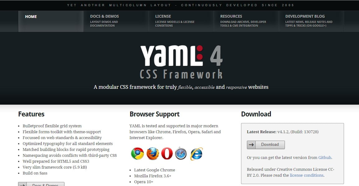
Over a decade, YAML has stuck in the developer’s mind because it builds truly flexible and cutting-edge responsive websites. YAML is the front-end module where you can make an elastic grid system to develop a stable design base. There are lots of interactive development formats that are optimized with the latest HTML5 and CSS3.
CSSwizardry-grids
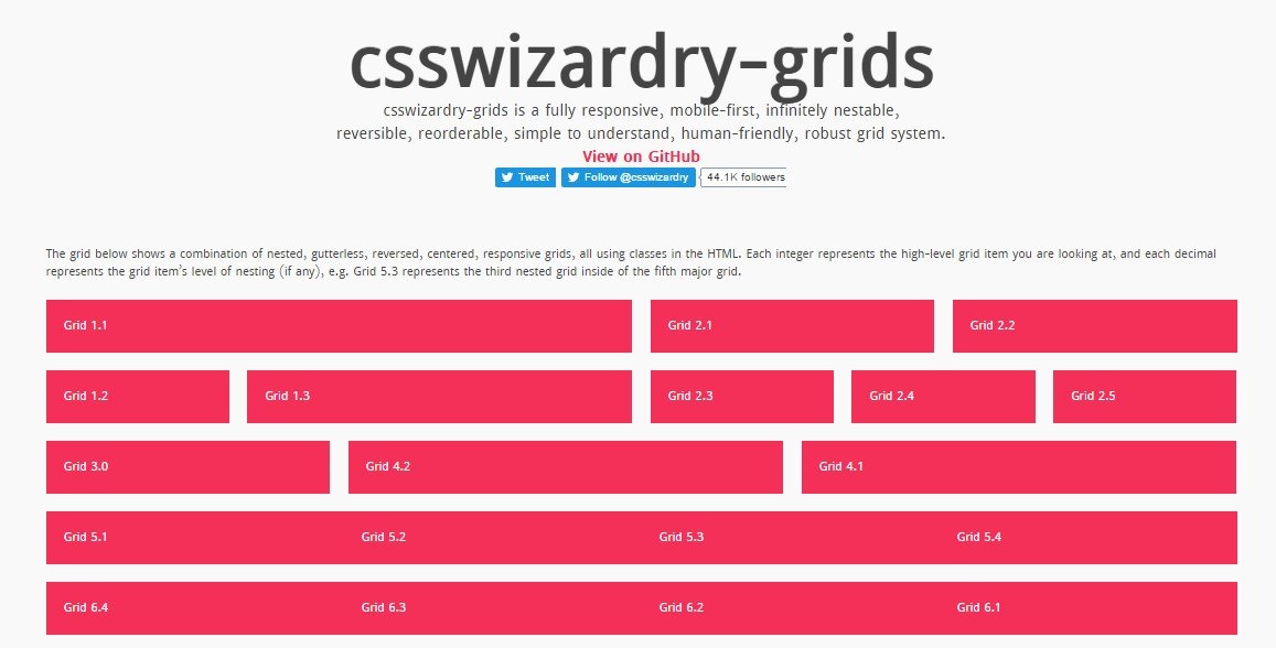
CSSwizardry-grids is an open-source grid system framework designed to transform building design. It’s a mobile-first responsive grid system with lots of possibilities. With this framework, you can create a single-page template with a high-quality user experience.
Skeleton

Skeleton here comes to build a responsive, mobile-friendly website according to your respective design. It works as a boilerplate and with a small collection of CSS materials that can help you build a website rapidly at any screen size you want.
Griddle
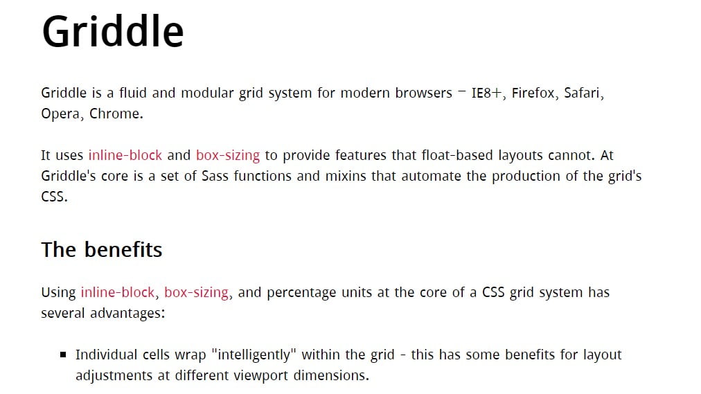
Griddle is a straightforward CSS grid system that is generated using the Sass functions as well as mixins. Additionally, this grid system puts extreme focus on the modern browsers we use. Moreover, it influences the method of CSS inline-block as well as the properties of box-sizing. This method will give you awesome layouts along with some new abilities that usual float-based layouts can’t make available to you.


